Now that we have covered creating your first website, let's get into making it look appealing to users. This is a compilation of what I believe to be the most essential CSS properties to get you started on making a beautiful website.
Sizing Properties
Margin/Padding
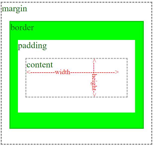
Margin controls how much the distance your element and adjacent elements and padding controls how much spacing is between your element's border and its content. Padding and margin can create what is known as negative space (space around and between a subject such as an image or text), which promotes readability to the user by guiding their eyes.

There are multiple ways for you to write the value for margin and padding--the easiest way to remember is that all 4 values spin in the direction of a clock with only 4 values on it (12, 3, 6, and 9). With each numbers representing the way the arrow is facing on the clock.
.myElement {
    /* Top Right Bottom Left */
    margin: 25px 15px 25px 15px;

    /* Top Right Bottom Left */
    padding: 25px 15px 25px 15px;

    /* Top/Bottom Right/Left */
    margin: 55px 15px;

    /* Top/Bottom/Right/Left */
    padding: 25px;
}
Property Values
| Value | Description |
|---|---|
| length | Value in px, pt, em, cm |
| % | Specify a margin in a percentage of the parent element |
| initial | Default value |
| inherit | Inherit the value from the parent element |
| auto | Let the browser decide |
Here is a JSFiddle that demonstrates the relationship between margin, padding, and border:
Width/Height
The width and height properties are fairly self explanatory. It's the width and height of your element!
Example:
.myElement {
    width: 100px;
    height: 100px;
}

.halfWidthElement {
    width: 50%;
}
Property Values
| Value | Description |
|---|---|
| length | Value in px, pt, em, cm, etc. |
| % | Percent of width of the parent |
| initial | Default value |
| inherit | Inherit the value from the parent element |
| auto | Let the browser decide |
Here is a widget to show you width, height, padding, margin, and how border affects elements.
Positioning Properties
Position
The position element is one of the most important CSS properties out there for deciding how your website will be laid out.
Example:
.myElement {
    position: absolute;
    position: relative;
    position: sticky;
    position: fixed;
}
Property Values
| Value | Description |
|---|---|
| initial | Default value |
| inherit | Inherit value from the parent element |
| relative | Whether absolutely positioned child elements should be positioned RELATIVE to this element |
| absolute | Absolutely positioned elements looks for the a parent descendant that has a relative, absolute, or fixed, position to position itself on. |
| static | This is the default position for DIV elements. Static is the default way of laying elements out |
| fixed | Fixed elements are positioned relative to the viewport |
| sticky | A sticky position is both like a relative and fixed position. The elemt will attempt to make itself always visible and stick to the top when the parent element is scrolled downward. |
Top/Right/Bottom/Left
The top, right, bottom, left CSS properties control fixed, and absolutely positioned elements.
.myElement {
    top: 15px;
    left: 25%;
    top: 1em;
    right: 5cm;
}
Property Values
| Value | Description |
|---|---|
| length | px, cm, em, etc. |
| % | Percent value of relative/fixed parent |
Here is a widget I've made to showcase some of the positions and how to use them.
Transform
Transform allows you do to all sorts of things to an element such as scaling, rotation, and skewing.
Property Values
| Value | Description |
|---|---|
| none | Default value |
| matrix | Transform the element by a matrix |
| translate(x, y) | Move the element from the left and top by x and y followed by any measurement (px, %, etc) |
| translateX(x) | Move the element from the left by x |
| translateY(y) | Move the element from the top by y |
| rotate(x) | Rotate the element by the given measurement (deg, turn, rad, etc.) of x |
| scale(x) | Scale the element by the given measurement of x |
| scale(x, y) | Scale the element by the given measurements of x and y |
| skew(x) | Skew the element by the given measurements (deg, turn, rad, etc.) of x |
| skew(x, y) | Skew the element by the given measurements (deg, turn, rad, etc.) of x and y |
It is also possible to chain the transform functions in one CSS property like this:
.myElement {
    transform: translate(-15px, -25px) rotate(45deg);
}
To learn more about the transform CSS property, Mozilla has an excellent explanation here.
Miscellaneous Properties
Box Shadow
Box shadows can add some really nice depth to your site.
Example:
.myElement {
/*Format: <horizontal offset> <vertical offset> <blur radius> <spread (optional)> <color> */
    box-shadow: 3px 3px 5px 5px #ccc;
}
I've created this CSS generator tool for you to try it out. Try adding this to one of your elements CSS rules and see what you can do with it.


